A homepage does not need to explain every service you have ever offered. It needs to help a new visitor answer three questions: Am I in the right place? Can this team help me? What should I do next?
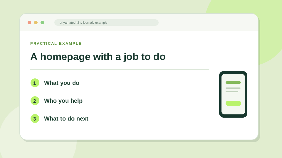
Start with the sentence a customer would use
“We deliver innovative digital solutions” could describe almost anyone. “We build fast, easy-to-manage websites for growing clinics” tells a visitor what you do and who you serve. A good headline sounds like a useful answer, not a pitch from a conference stage.
Put one short supporting paragraph underneath. Explain the outcome and, if it matters, the way you work. Keep the first button direct: “Book a consultation”, “See the work” or “Get a quote”. If you offer several services, one clear primary action and one quieter secondary link are usually enough.
Give people proof before you ask for a form
Show a real project, a specific service description, a client review you are allowed to publish, or the people behind the business. A row of vague claims does less work than one concrete example. If a visitor has to scroll past four sections before learning what you actually do, edit the order.
A quick test you can run today
Open the homepage on a phone. Cover the logo and ask someone unfamiliar with the business to describe the offer after ten seconds. Then ask them where they would click to enquire. If their answers differ from yours, your page has given you an editing brief.
Google’s SEO Starter Guide also recommends clear, useful, well-organised content. That is a good search habit because it is a good visitor habit first.
What the first screen must do
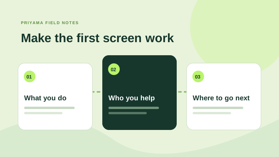
A visitor should be able to answer three questions quickly: what do you do, who is it for, and what can I do next? A clever headline can still work, but it needs a clear supporting sentence. Put the main action close to the message. Give people a second path to explore services if they are not ready to enquire.
Imagine a business owner arriving from search on a phone. They should not have to decode agency language or open five menu items to find relevant work. Our mobile website guide is a useful companion when checking this first impression.
Let the rest of the page answer the next question
After the first screen, readers may want to know what is included, how you work and whether you have done similar work before. Arrange sections in that order. Link to specific service pages for the detail, and keep the contact route visible without repeating the same large button every few lines. A homepage is a guide to the right next page, not a place to say everything at once.
The five-second check
- Can a stranger say what you do?
- Can they tell whether you help a business like theirs?
- Can they find one obvious next step?