Most mobile frustrations are ordinary: a menu that hides the last link, a button too close to another button, or a form that asks for more typing than the task deserves. Fixing these details often does more for the experience than adding another animation.
Make the first screen useful
Your headline should still make sense when it wraps to three lines. The main action should be visible without hunting. Keep decorative elements from pushing the offer halfway down the page. Test on a narrow phone, not only by shrinking a desktop browser window.
Design for fingers and interruptions
Give important controls room to breathe. A visitor may be on a bus, holding a coffee, or switching between your site and a message. A menu should open reliably, show every destination, and close when a link is selected. Forms should use the right keyboard for email and phone fields, label every input and show a useful message after submission.
The W3C guidance on target size sets a 24 by 24 CSS pixel minimum in many cases. We aim for larger primary buttons because comfortable is better than merely compliant.
Check the end of the journey
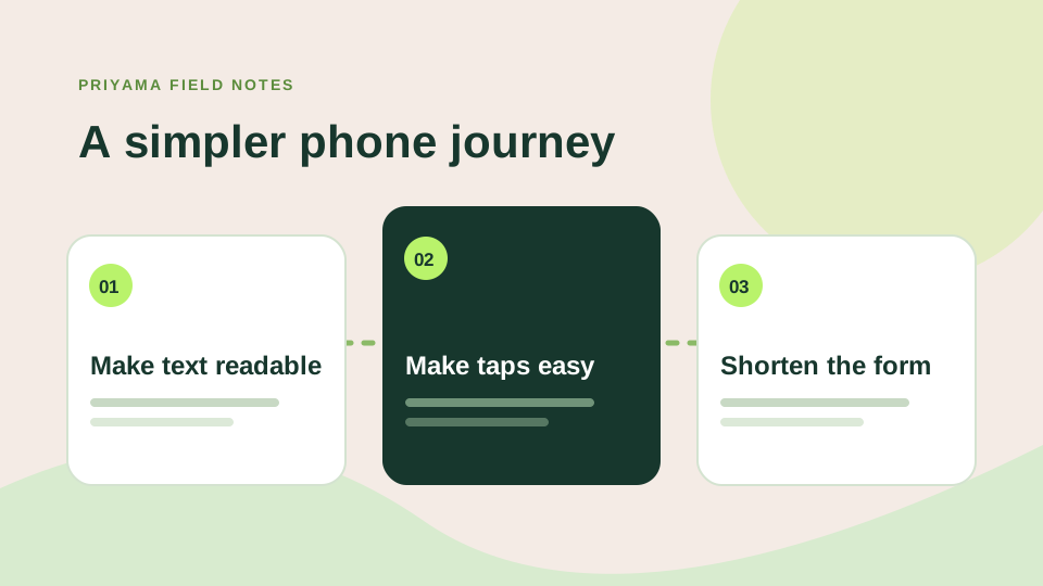
Do not stop at the homepage. Open the contact form, thank-you message, cart if you have one, and the email the visitor receives. Try them with the keyboard and at 200% zoom. Your mobile experience is only as smooth as its awkwardest step.
Test with one thumb and no explanation
Open the site on a real phone. Can you see what the business does without zooming? Can you open the menu, choose a service and reach the contact form with one hand? Try tapping near the edges of buttons. If you need to be unusually precise, the target is probably too small or too close to another control.
Forms deserve their own pass. Use the right keyboard for email and phone fields, keep labels visible and explain errors beside the field that needs attention. The page should not jump away from a half-finished form. Before spending on mobile traffic, run the same check on the landing page your ad opens.
Watch for the quiet annoyances
A giant sticky banner can hide the next step. A carousel may move before someone has read it. An image can push text down as it arrives. These are easy to miss on a desktop preview. Test at different widths and with larger text settings; a layout that survives those conditions is usually easier for everyone.
Try this with your phone
- Open the last item in the menu.
- Complete the enquiry form without zooming.
- Increase text size and see what breaks.